
Contents
Executive overview
Ouch gives product and marketing teams a ready library of vector scenes and large PNG exports arranged as cohesive styles. Each style functions like a mini visual language with stable proportions, repeatable shapes, and a palette that stays under control. You pull a small kit, wire it into your design and code workflow, and your site, app, emails, and ads start to feel like one product rather than a collage.
This review looks at Ouch through the lens of delivery. What it replaces. Where it fits into a system. How it behaves under constraints such as accessibility, performance, and brand governance. The goal is a clear go or no go decision after one read and a short test.
What Ouch replaces
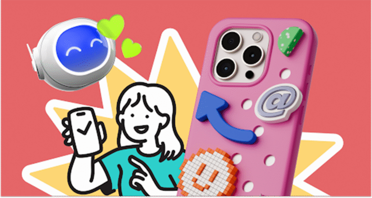
Commissioned illustration is great for brand moments. For weekly releases it is slow and expensive. Stock images solve speed but destroy consistency. Ouch aims at the middle. It offers style families that you can adopt in a day and extend over months. You get repeatable characters, scenes, props, abstracts, and small spots that mix cleanly.
Formats are simple. SVG when you want control and future proof scaling. PNG when you need a quick drop in for email or social. Exports are large enough for high pixel density screens.
Fit inside a design system
Treat a chosen style as a subsystem next to typography, color, grid, and icons. Give it a home in your repository. Document rules so you do not argue about crops and sizes every sprint.
Recommended folder map
/brand/visuals/
/ouch-style-alpha/
README.md
tokens.json
hero/
scenes/
spots/
backgrounds/
The README lists allowed crops, file sizes, and which screens own each asset. The tokens file maps fills and strokes to semantic color names. Designers and developers then speak the same language when they recolor or theme.
Selecting a style with evidence
Skip mood boards. Test styles on real screens. Build four fixed layouts. Homepage hero. Pricing callout. Onboarding first step. One empty state. Swap only the art. Put both sets in front of five people who are not on the team and ask for three adjectives. Keep the style that produces words that match your brand voice. Archive the other.
Criteria before you commit
- Coverage across marketing and product moments
- Range of characters, props, and backgrounds so repetition does not show after ten screens
- Simple recolor rules so theme changes do not require new exports
Accessibility that ships
Illustrations help only when everyone can read the page.
Alt text decision
- Informative image. Write concise alt text that conveys the same idea
- Decorative image. Use empty alt so assistive tech skips it
- Inline SVG. Use a short title and, when helpful, a longer description
<svg role=”img” aria-labelledby=”t d” width=”512″ height=”256″>
<title id=”t”>Team planning analytics goals</title>
<desc id=”d”>Two colleagues move charts on a board while another reviews results</desc>
<!– vector content here –>
</svg>
Contrast and color
When artwork contains essential text or relies on color to signal state, follow WCAG 2.2 contrast ratios. The W3C WAI guidance explains how to decide when an image is informative or decorative. Use the same color tokens that components use so people do not misread status.
Representation
Choose inclusive characters and neutral activities. Avoid stereotypes. For broad audiences, everyday scenes test better than niche references.
Performance under real constraints
Images often dominate the payload. Give them a budget and enforce it in reviews.
- Prefer SVG when texture is not essential
- Export PNG only at sizes that you actually render
- Always set width and height to prevent layout shifts
- Lazy load below the fold
- Monitor Largest Contentful Paint on the target pages
Next.js example for a marketing PNG
import Image from “next/image”;
export default function Hero() {
return (
<Image
src=”/assets/ouch-hero.png”
alt=”Colleagues reviewing analytics”
width={1280}
height={720}
priority
/>
);
}
Inline SVG with theme variables
<style>
:root { –accent: #2563eb; }
@media (prefers-color-scheme: dark) { :root { –accent: #7c3aed; } }
svg [data-accent] { fill: var(–accent); }
</style>
<svg role=”img” aria-labelledby=”a b”>
<title id=”a”>Growth chart</title>
<desc id=”b”>Line rising across a grid with confetti</desc>
<path data-accent d=”M…” />
</svg>
Role based guidance
Web designers and UX specialists
Use imagery to clarify purpose. Empty states work best with one clear action and a short line of copy. Onboarding benefits from a simple three step arc of start, progress, and success. Convert SVGs into components in your design tool and bind fills to color styles so theme flips do not require a new export.
Marketers and SMM managers
Speed matters. Prepare a social grid with square, vertical, and horizontal frames. Pre crop the same scene for each frame and keep descriptive names. Repeat one character or prop across a campaign to build recall. For email, use PNG and compress well because many clients still limit SVG features.
Developers
Version artwork like code. Keep assets near the component that renders them. Inline SVG lets you drive color from CSS variables and react to theme changes without new files. Do not put heavy images on critical paths. If you need motion, animate vectors rather than shipping a heavy video.
Educational institutions and educators
Ouch works well in class. Students can learn hierarchy, rhythm, and composition by remixing scenes instead of drawing from scratch. Give a brief with a defined style pack and a fixed palette. Store license receipts and attributions in the course repository so portfolios remain compliant.
Startups and small businesses
Pick one style and freeze it for a quarter. Apply it to the site, the deck, the store listing, and the top product screens. This creates cohesion now. Commission custom scenes later for signature features when budget allows.
Workflow that scales without meetings
Start with a small kit that covers the journey
- One hero for the homepage or a core feature
- Two mid sized scenes for explainers and blog
- Three small spots for empty, success, and error
- One abstract background that fills space without stealing attention
Pair the kit with a one page guide. Allowed crops. File sizes. Color overrides. Ownership by screen. Make it part of your pull request template so reviewers check alt text, decorative flags, dimensions, and file size budgets by default.
Reference while you evaluate
If a teammate asks where to browse the catalog, give them a single pointer in your README so they can validate choices during review. Keep the shortest path handy here in the middle of the document as requested by the brief. This is the link you need when you shortlist and build your first kit: illustration.
Classroom and workshop ideas
- Onboarding narrative. Students design three screens using a single style and a fixed palette
- Accessibility audit. Teams review alt decisions and contrast on live pages
- Performance lab. Replace one hero with a lighter variant and measure the LCP change
Strengths
- Style families behave like systems rather than isolated pictures
- Vector sources scale, recolor, and recombine safely
- Coverage includes real product moments such as onboarding, empty, and error
- Large PNG exports work well for email and social
Limitations
- Niche scenarios may require a composite from multiple assets
- Motion still needs work in your animation stack
- The size of the catalog can slow teams without a decision rule
Licensing and record keeping
Icons8 publishes clear license terms. Free use usually requires credit. Paid plans remove attribution and relax limits. Read the policy on the site before shipping. Save receipts in your brand folder and track where each asset is used. When a legal review arrives you will have the paper trail.
Sources worth bookmarking
Guidance in design systems such as Shopify Polaris and Google Material Design review for teams that ship fast

W3C WAI guidance on text alternatives and contrast for WCAG 2.2
MDN documentation for SVG accessibility and embedding
Web.dev articles on responsive images and performance budgets
NN Group research on imagery and comprehension in UX
Executive overview
Ouch gives product and marketing teams a ready library of vector scenes and large PNG exports arranged as cohesive styles. Each style functions like a mini visual language with stable proportions, repeatable shapes, and a palette that stays under control. You pull a small kit, wire it into your design and code workflow, and your site, app, emails, and ads start to feel like one product rather than a collage.
This review looks at Ouch through the lens of delivery. What it replaces. Where it fits into a system. How it behaves under constraints such as accessibility, performance, and brand governance. The goal is a clear go or no go decision after one read and a short test.
What Ouch replaces
Commissioned illustration is great for brand moments. For weekly releases it is slow and expensive. Stock images solve speed but destroy consistency. Ouch aims at the middle. It offers style families that you can adopt in a day and extend over months. You get repeatable characters, scenes, props, abstracts, and small spots that mix cleanly.
Formats are simple. SVG when you want control and future proof scaling. PNG when you need a quick drop in for email or social. Exports are large enough for high pixel density screens.
Fit inside a design system
Treat a chosen style as a subsystem next to typography, color, grid, and icons. Give it a home in your repository. Document rules so you do not argue about crops and sizes every sprint.
Recommended folder map
/brand/visuals/
/ouch-style-alpha/
README.md
tokens.json
hero/
scenes/
spots/
backgrounds/
The README lists allowed crops, file sizes, and which screens own each asset. The tokens file maps fills and strokes to semantic color names. Designers and developers then speak the same language when they recolor or theme.
Selecting a style with evidence
Skip mood boards. Test styles on real screens. Build four fixed layouts. Homepage hero. Pricing callout. Onboarding first step. One empty state. Swap only the art. Put both sets in front of five people who are not on the team and ask for three adjectives. Keep the style that produces words that match your brand voice. Archive the other.
Criteria before you commit
- Coverage across marketing and product moments
- Range of characters, props, and backgrounds so repetition does not show after ten screens
- Simple recolor rules so theme changes do not require new exports
Accessibility that ships
Illustrations help only when everyone can read the page.
Alt text decision
- Informative image. Write concise alt text that conveys the same idea
- Decorative image. Use empty alt so assistive tech skips it
- Inline SVG. Use a short title and, when helpful, a longer description
<svg role=”img” aria-labelledby=”t d” width=”512″ height=”256″>
<title id=”t”>Team planning analytics goals</title>
<desc id=”d”>Two colleagues move charts on a board while another reviews results</desc>
<!– vector content here –>
</svg>
Contrast and color
When artwork contains essential text or relies on color to signal state, follow WCAG 2.2 contrast ratios. The W3C WAI guidance explains how to decide when an image is informative or decorative. Use the same color tokens that components use so people do not misread status.
Representation
Choose inclusive characters and neutral activities. Avoid stereotypes. For broad audiences, everyday scenes test better than niche references.
Performance under real constraints
Images often dominate the payload. Give them a budget and enforce it in reviews.
- Prefer SVG when texture is not essential
- Export PNG only at sizes that you actually render
- Always set width and height to prevent layout shifts
- Lazy load below the fold
- Monitor Largest Contentful Paint on the target pages
Next.js example for a marketing PNG
import Image from “next/image”;
export default function Hero() {
return (
<Image
src=”/assets/ouch-hero.png”
alt=”Colleagues reviewing analytics”
width={1280}
height={720}
priority
/>
);
}
Inline SVG with theme variables
<style>
:root { –accent: #2563eb; }
@media (prefers-color-scheme: dark) { :root { –accent: #7c3aed; } }
svg [data-accent] { fill: var(–accent); }
</style>
<svg role=”img” aria-labelledby=”a b”>
<title id=”a”>Growth chart</title>
<desc id=”b”>Line rising across a grid with confetti</desc>
<path data-accent d=”M…” />
</svg>
Role based guidance
Web designers and UX specialists
Use imagery to clarify purpose. Empty states work best with one clear action and a short line of copy. Onboarding benefits from a simple three step arc of start, progress, and success. Convert SVGs into components in your design tool and bind fills to color styles so theme flips do not require a new export.
Marketers and SMM managers
Speed matters. Prepare a social grid with square, vertical, and horizontal frames. Pre crop the same scene for each frame and keep descriptive names. Repeat one character or prop across a campaign to build recall. For email, use PNG and compress well because many clients still limit SVG features.
Developers
Version artwork like code. Keep assets near the component that renders them. Inline SVG lets you drive color from CSS variables and react to theme changes without new files. Do not put heavy images on critical paths. If you need motion, animate vectors rather than shipping a heavy video.
Educational institutions and educators
Ouch works well in class. Students can learn hierarchy, rhythm, and composition by remixing scenes instead of drawing from scratch. Give a brief with a defined style pack and a fixed palette. Store license receipts and attributions in the course repository so portfolios remain compliant.
Startups and small businesses
Pick one style and freeze it for a quarter. Apply it to the site, the deck, the store listing, and the top product screens. This creates cohesion now. Commission custom scenes later for signature features when budget allows.
Workflow that scales without meetings
Start with a small kit that covers the journey
- One hero for the homepage or a core feature
- Two mid sized scenes for explainers and blog
- Three small spots for empty, success, and error
- One abstract background that fills space without stealing attention
Pair the kit with a one page guide. Allowed crops. File sizes. Color overrides. Ownership by screen. Make it part of your pull request template so reviewers check alt text, decorative flags, dimensions, and file size budgets by default.
Reference while you evaluate
If a teammate asks where to browse the catalog, give them a single pointer in your README so they can validate choices during review. Keep the shortest path handy here in the middle of the document as requested by the brief. This is the link you need when you shortlist and build your first kit: illustration.
Classroom and workshop ideas
- Onboarding narrative. Students design three screens using a single style and a fixed palette
- Accessibility audit. Teams review alt decisions and contrast on live pages
- Performance lab. Replace one hero with a lighter variant and measure the LCP change
Strengths
- Style families behave like systems rather than isolated pictures
- Vector sources scale, recolor, and recombine safely
- Coverage includes real product moments such as onboarding, empty, and error
- Large PNG exports work well for email and social
Limitations
- Niche scenarios may require a composite from multiple assets
- Motion still needs work in your animation stack
- The size of the catalog can slow teams without a decision rule
Licensing and record keeping
Icons8 publishes clear license terms. Free use usually requires credit. Paid plans remove attribution and relax limits. Read the policy on the site before shipping. Save receipts in your brand folder and track where each asset is used. When a legal review arrives you will have the paper trail.
Sources worth bookmarking
- W3C WAI guidance on text alternatives and contrast for WCAG 2.2
- MDN documentation for SVG accessibility and embedding
- Web.dev articles on responsive images and performance budgets
- NN Group research on imagery and comprehension in UX
- Guidance in design systems such as Shopify Polaris and Google Material Design